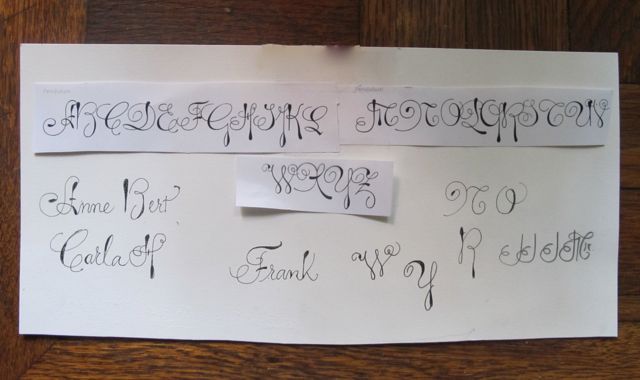
It's been awhile! I have been busy but I thought you would like to see this font called "Pendulum" that I had to do for place cards. I had to learn it in a week and to me, it was a little hard to read. I talked the client into at least using a more readable lower case. The bottom photo is the actual font that I had to download, next to that is some of my practice.


2 comments:
I think you've done an excellent job Hilary! I think the lettering is very interesting and pleasing to the eye. :)
I just recently discovered this fun font and want to do something in it. You did an amazing job creating it. It's a bit odd for the wedding but at least you got to use it. What fun! Great job!
Post a Comment